

The Macondo design system is the structural foundation for Spoonity's next generation platform, engineered specifically to translate complex data operations into intuitive user workflows.
User experience design was top-of-mind for us when we started this project in 2025. To help us achieve our goals, we partnered with a world-class design agency, Orizon, to audit our current product, and work with us to design the future of the platform.
Enter Orizon Design
We partnered with Orizon, a world-class digital product design agency based out of Montreal, Canada and recognized globally to architect a design language capable of scaling with our next-generation ambitions.
Orizon has worked with some of the world's leading digital brands like Google, Uber, and Netflix to create unforgettable user experiences.
Our collaboration with Orizon was able to marry Spoonity’s 15 years of deep domain expertise in merchant workflows, pain points, and loyalty with Orizon’s elite interface engineering.
Rather than limiting this work to a superficial visual facelift, the engagement began with a rigorous, data-driven design audit of our existing interface in order to test our usability telemetry against modern SaaS heuristics.
Together with their designers, we explored color palettes, typography, layouts, and more in our attempts to address the most significant pains around navigation, cognitive load, and lack of consistency across the platform.
Building Macondo
The name "Macondo" comes from the magical village in One Hundred Years of Solitude, a novel by South American Nobel prize winner Gabriel García Márquez. It is a metaphor for a product of endless possibilities, driven by customer journeys and the power of data.
Two of the most important areas of focus for this new design system are:
Colors
One of the most important details in Macondo is the way we use colors to support the context of working inside the product rather than simply reinforcing our brand.
For primary buttons, we opted for a dark, neutral grey in light mode and white in dark mode over our brand violet like we did with earlier dashboards. This results in a calmer, more focused, and easier to scan experience for the user. This theme is applied throughout the dashboard, as neutral shades are used on most typography, buttons, and input elements while colors are intentionally sprinkled sparingly to reinforce memorable interactions.
The challenge with this approach is that facing a dashboard full of neutral shades can easily turn into a barren, lifeless experience for users. We therefore had to choose our shades very carefully. The color of our background has a hint of orange in light mode, and blue in dark mode. The colors picked for borders of sections that are stacked on top of each other are just pronounced enough to drive home the essence of hierarchy without being distracting.
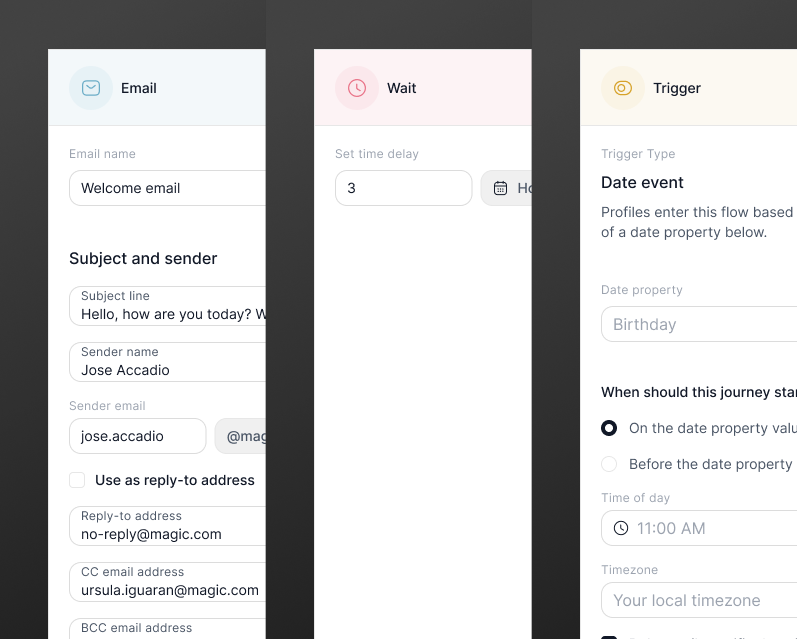
Colors still play a big role in Macondo.
In fact, we ended up using more colors than previously, albeit with a softer touch. We also chose to use more pastel colors to create a more approachable visual experience. The more muted tones lighten visual intensity and help the interface feel less crowded.
Those colors had to be treated intentionally in the product as there is a fine line between giving the design a bit of character, and making the product feel childish and untrustworthy. At the end of the day, we are making a product for serious people to do serious work.
We assign semantics to colors when they are used in certain components to communicate a tone. Examples include blue for information, red for critical or danger, and yellow for warnings.
We also introduced colors to the action nodes in our canvas elements so users can quickly tell different types of components from each other, with consistency being reinforced through user interaction.
The canvas
As part of the design study, we wanted to highlight an important element of where we see our next-generation platform going. Within the canvas, users will be able to create multi-step workflows that can be executed manually or as the result of some kind of "trigger".
We chose a horizontal orientation to promote visual scannability, as well as to optimize the workspace for widescreen modern displays.
This design decision is based on the understanding that this orientation aligns better with how users scan the workflow, making it more intuitive and easier to navigate. For more complex workflows that include conditional logic, a horizontal workflow allows us to take advantage of a narrower viewport, saving users from endless vertical scrolling.
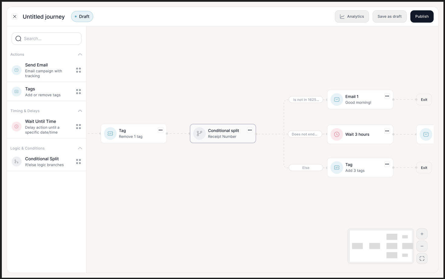
We also made the workflow canvas “float” atop the background instead of expanding it to the edge of the screen. The bounding area of the canvas has round corners to stay consistent with the approachable, friendly feel of the rest of the product. We also reduced the width of the configuration panel and action panel to make the product feel more compact and create more space for the horizontal workflow.
What’s next
We're hard at work applying Macondo to the next generation of the Spoonity platform, which we hope to have ready for our merchants to begin experiencing later this year.
The brands we work with have always been customer-obsessed, and we're thrilled to see our own investments in user experience design come to life through this project.
You can expect to hear more from us in the coming months about Macondo through additional deep-dives, articles, and updates to our documentation and code samples.